Improving Usability
in Amplifi Document Editor
Accessibility and UX design
Improving Usability
in Amplifi Document Editor
The project is a collaboration between Amplifi Global and Goldsmiths, University of London which aim to investigate ways to enhance accessibility and inclusive in the online platform.
Accessibility and UX design
The project is a collaboration between Amplifi Global and Goldsmiths, University of London which aims to investigate ways to enhance accessibility and inclusive in the online platform.
About Amplifi
Amplifi utilizes AI and machine learning to enable Firms to communicate legal and regulated information to customers in a simpler, more tailored, and personalized manner.
Let’s make
your documents
more intelligible simpler to
understand.
AI machine learning
An improved language simplification platform


Improving Usability
in Amplifi Document Editor
About Amplifi
Amplifi utilizes AI and machine learning to enable Firms to communicate legal and regulated information to customers in a simpler, more tailored, and personalized manner.
An improved language simplification platform
AI machine learning
Let’s make
your documents
more intelligible simpler to
understand.
This project aims to help users with red-green color vision deficiency, the most common type of color vision disorder, by making it easier for them to access the Amplifi platform, in the document editor.
Research Methodology
This study adopts the method of Design Thinking and organizes the entire design process according to its five stages.
Since the core of this study is to identify existing barriers to accessibility and propose inclusive measures, it combines a variety of qualitative and quantitative research methods.
Research Methodology
This study adopts the method of Design Thinking and organizes the entire design process according to its five stages.
Since the core of this study is to identify existing barriers to accessibility and propose inclusive measures, it combines a variety of qualitative and quantitative research methods.
This project aims to help users with red-green color vision deficiency, by making it easier for them to access the Amplifi platform.
Accessibility and UX design
The project is a collaboration between Amplifi Global and Goldsmiths, University of London which aim to investigate ways to enhance accessibility and inclusive in the online platform.
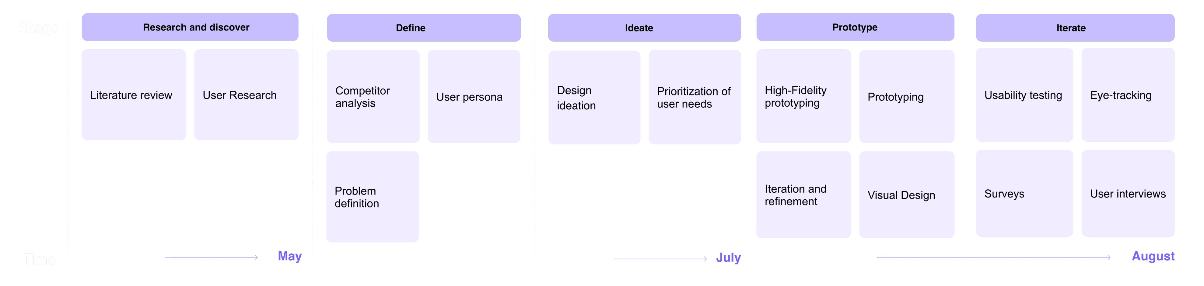

Interviews with red-green colorblind users were conducted to uncover specific accessibility challenges for the platform.
Based on findings from the Empathize and defined stages, prioritize user pain points and needs and conceive design solutions.
During the testing phase, I conducted usability tests and used eye tracking technology to collect user data.
Empathize
Qualitative interviews were conducted with participants to obtain users’ pain points and needs.
Qualitative interviews were conducted with participants to obtain users’ pain points and needs.

Empathize
Qualitative interviews were conducted with participants to obtain users’ pain points and needs.
Insights from interview
1. Complex color and lack enough contrast, which makes users have difficulty identifying information.
2. The platform structure confuses users, without the description of the important elements.
3. Lack of alternative descriptions of color, such as text, icon, shape, etc
Insights from interview
1. Complex color and lack enough contrast, which makes users have difficulty identifying information.
2. The platform structure confuses users, without the description of the important elements.
3. Lack of alternative descriptions of color, such as text, icon, shape, etc
Insights from interview
1. Complex color and lack enough contrast, which makes users have difficulty identifying information.
2. The platform structure confuses users, without the description of the important elements.
3. Lack of alternative descriptions of color, such as text, icon, shape, etc

About Amplifi
Amplifi utilizes AI and machine learning to enable Firms to communicate legal and regulated information to customers in a simpler, more tailored, and personalized manner.
Let’s make
your documents
more intelligible simpler to
understand.
An improved language simplification platform
AI machine learning
This project aims to help users with red-green color vision deficiency, the most common type of color vision disorder, by making it easier for them to access the Amplifi platform, in the document editor.
Research Methodology
This study adopts the method of Design Thinking and organizes the entire design process according to its five stages.
Since the core of this study is to identify existing barriers to accessibility and propose inclusive measures, it combines a variety of qualitative and quantitative research methods.
Interviews with red-green colorblind users were conducted to uncover specific accessibility challenges for the platform.
Based on findings from the Empathize and defined stages, prioritize user pain points and needs and conceive design solutions.
During the testing phase, I conducted usability tests and used eye tracking technology to collect user data.
Competitors analysis
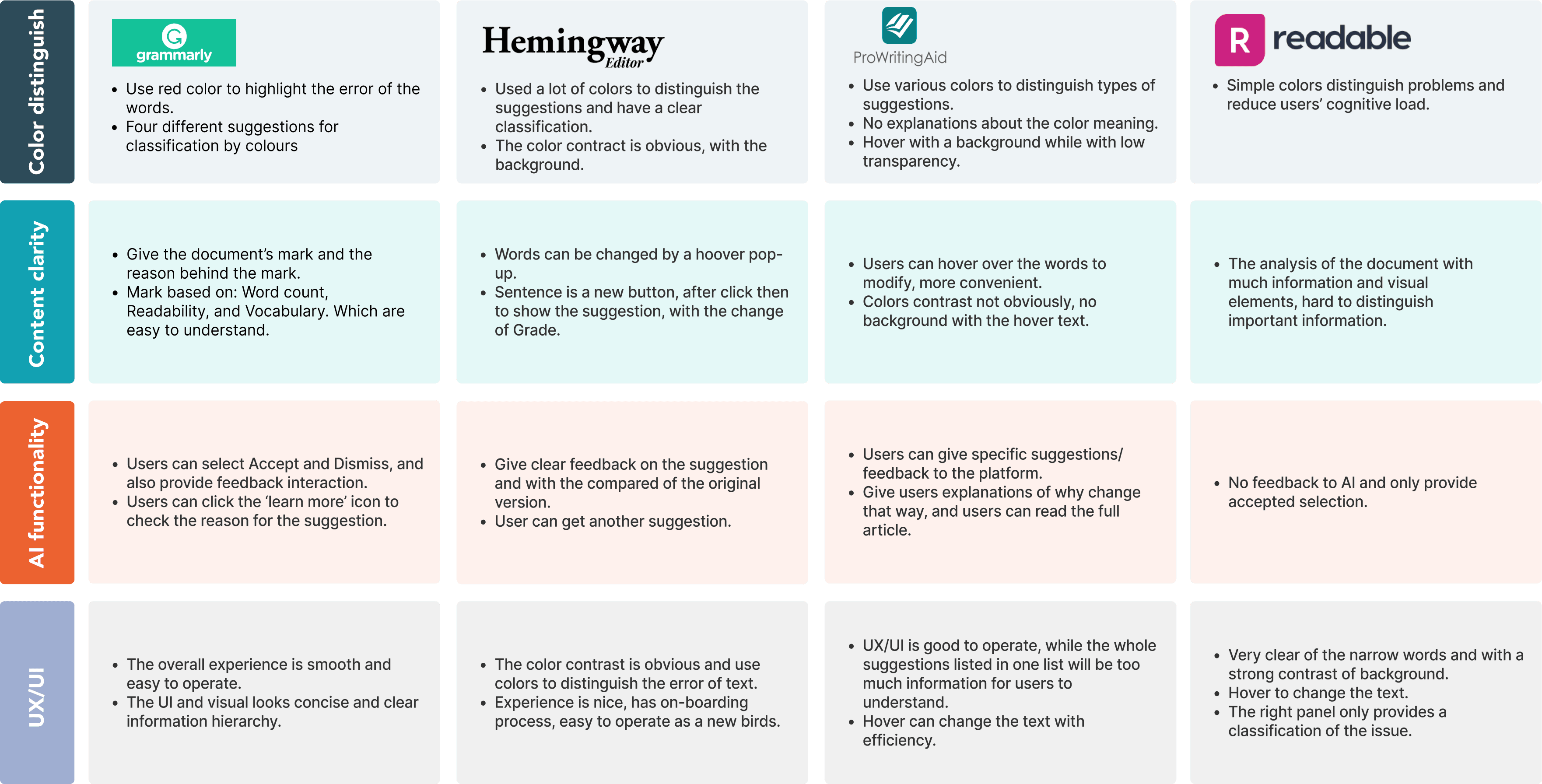
Among competing products, most of them use colors to distinguish different types of suggestions; I analyzed the advantages and disadvantages of competing products in terms of color, interaction, and content clarity.
Competitors analysis
Among competing products, most of them use colors to distinguish different types of suggestions; I analyzed the advantages and disadvantages of competing products in terms of color, interaction, and content clarity.
Competitors analysis
Among competing products, most of them use colors to distinguish different types of suggestions; I analyzed the advantages and disadvantages of competing products in terms of color, interaction, and content clarity.
Design Goals
1. Provide user-friendly color modes, improve color contrast, and add multiple visual languages.
Simplify the platform structure and content clarity, streamline the categories of language suggestions.
To add more visual elements to convey information.
Design Goals
1. Provide user-friendly color modes, improve color contrast, and add multiple visual languages.
Simplify the platform structure and content clarity, streamline the categories of language suggestions.
To add more visual elements to convey information.


Ideation & Prototype
After analyzing user insights and based on the urgent and important metrics, I made design features to enhance the platform's accessibility and tackle existing issues.
Ideation & Prototype
After analyzing user insights and based on the urgent and important metrics, I made design features to enhance the platform's accessibility and tackle existing issues.
Design update through the user feedback
Design Iterate
After gathering insights from user interviews and competitor analysis, a usability test was conducted with six red-green color-blind participants, providing valuable feedback for prototype iteration.
Design Iterate
After gathering insights from user interviews and competitor analysis, a usability test was conducted with six red-green color-blind participants, providing valuable feedback for prototype iteration.
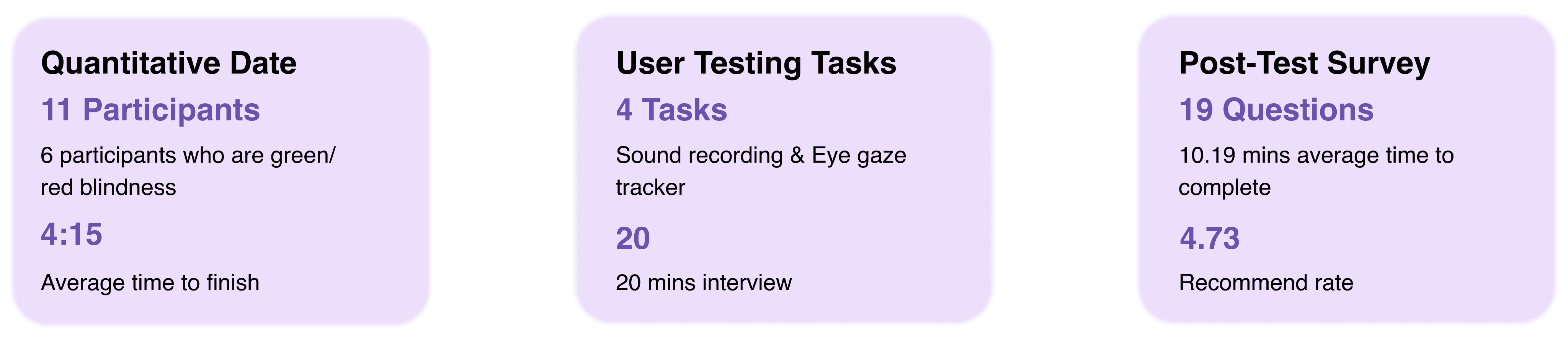
Design update through the user feedback

Implementing feedback
Every step of the design relies on participants feedback, and the quality of the prototype is continuously improved through user-centered design.
Implementing feedback
Every step of the design relies on participants feedback, and the quality of the prototype is continuously improved through user-centered design.


Design Iterate
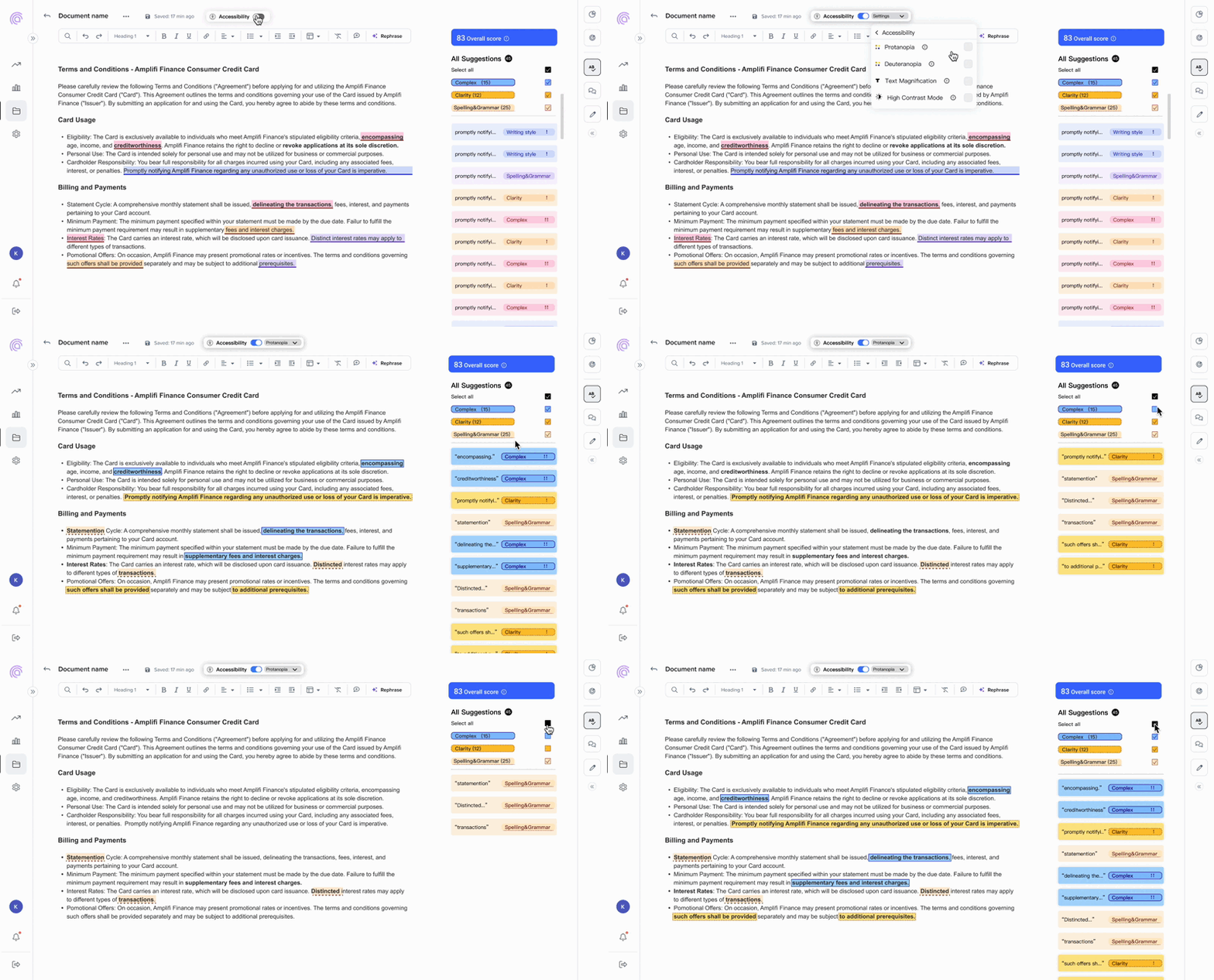
The research combined quantitative and qualitative methods, using eye tracking, surveys, and user interviews.
Design Iterate
The research combined quantitative and qualitative methods, using eye tracking, surveys, and user interviews.


Eye-tracking heat maps highlight areas of high user engagement.The heat maps show The existing accessibility model button is easy to operate and identify
Eye-tracking heat maps highlight areas of high user engagement.The heat maps show The existing accessibility model button is easy to operate and identify
Shows notable saccades page, proving the effectiveness of the color in guiding users to pay attention to relevant information.
Shows notable saccades page, proving the effectiveness of the color in guiding users to pay attention to relevant information.
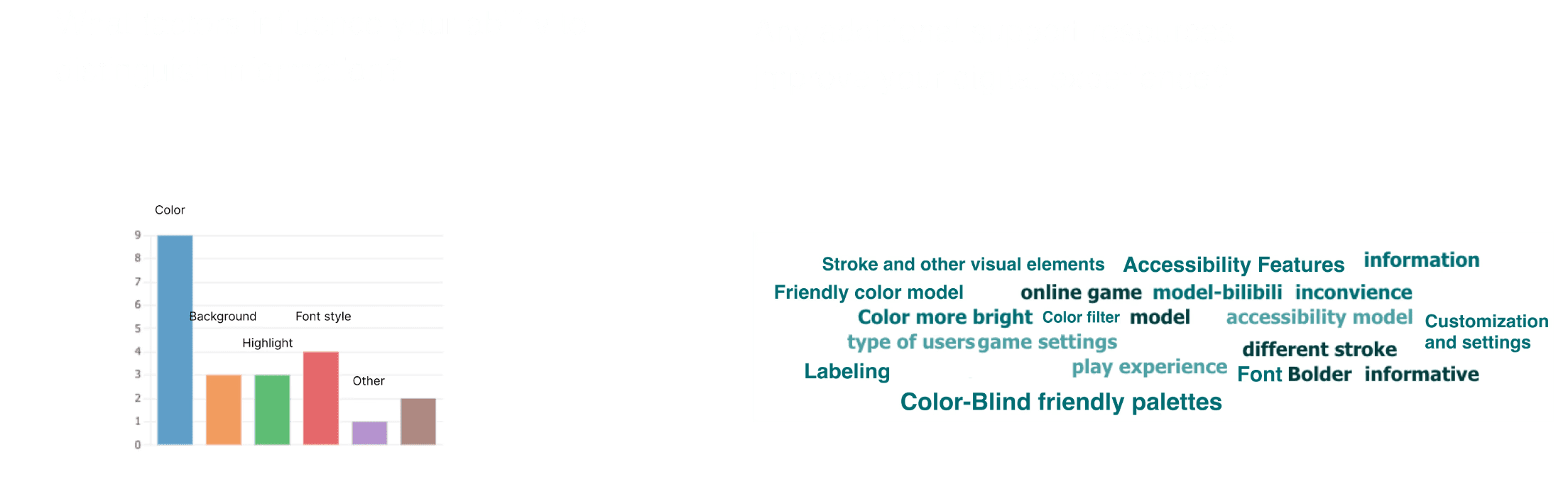
User feedback from the second of usability test
The color adjustments and friendly mode were validated, with 82% of users finding the platform easy to use, and the Filter function receiving a rating of 4.36.
User feedback from the second of usability test
The color adjustments and friendly mode were validated, with 82% of users finding the platform easy to use, and the Filter function receiving a rating of 4.36.


Final design and reflection
This project reveals the specific needs and challenges of color-blind and color-impaired users when using the platform. Based on human-centered design methodology the platform is more accessible to green-red blindness users and enhances the whole platform more inclusive.
After 2 rounds of usability tests, collected useful user feedback and implemented it into a new prototype. Participants gave positive feedback, 75% of participants they mentioned that the new color model is friendly for them to operate and with more clarify structure. And from survey we collected data that overall of the recommendation rate is 4.73/5.
Final design and reflection
This project reveals the specific needs and challenges of color-blind and color-impaired users when using the platform. Based on human-centered design methodology the platform is more accessible to green-red blindness users and enhances the whole platform more inclusive.
After two rounds of usability tests, we collected useful user feedback and implemented it into a new prototype. Participants gave positive feedback. 75% of participants mentioned that the new color model is friendly for them to operate and has a more clear structure. From the survey, we collected data that the overall recommendation rate is 4.73/5.